Today, data visualization is all the rage. It doesn’t matter what kind of information you want to show for school, work, or high-level business demos. You should always show data in a very visual way.
For this reason, making a moving bar chart race can be very helpful when showing numbers. They are interesting to look at and show statistics in an engaging way.
Bar Race Chart Generators Without Code Knowledge
Here are some online and offline tools that you can use to make a bar chart race. You can use them anywhere. You can give these tools a dataset to use to make a moving chart, a GIF, or a link to the chart that you want to share. You are free to make and use as many bar charts as you want. I’ve also added some open-source tools to the list. You can use them close to home or even run them on your own server.
FabDev
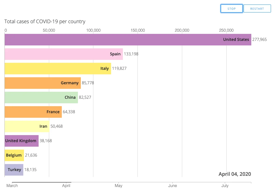
It’s pretty easy to use FabDev to make a bar chart race. You only need to upload a CSV file with all the data you need and add the number of bars you want to see and the length of time in seconds. When you’re done, click the “Generate Bar Chart Race” button to see a preview right away.
A small problem with FabDev is that it is a very basic GitHub code that needs more support, and you can’t change the font, labels, colors, or images. For a GIF or movie file, you will also need to record your screen while it plays. But if you only use it occasionally, the other choices below might be better for you.
Flourish Studio

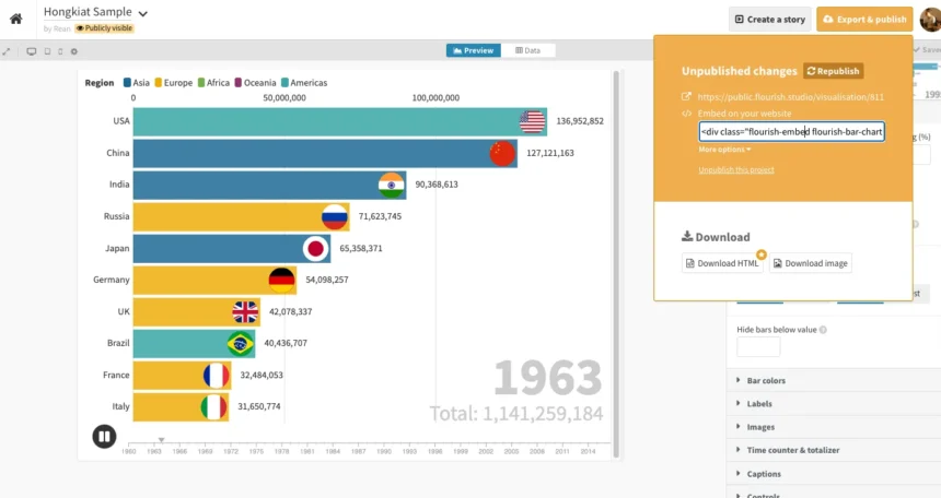
One of the visualization tools in Flourish.studio is the bar chart race and column chart race templates, which you can change in any way you want.
The free version lets you do a lot of things, but it might not let you publish it as an HTML file. Having said that, you can embed it on your website if that’s what you want to do. To embed, click on Export & Publish and copy the code that comes up.
Zoho Sheets
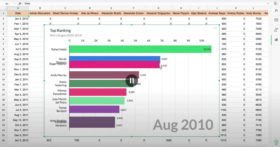
It’s a lot like Google Sheets, but Zoho Sheets has extra features that you won’t find in free files. One way is to add animated race charts that make it easy to see the data.
If you know how to use spreadsheet programs like Google Sheets or Microsoft Excel, it’s pretty easy to use. Also, you can change a lot about it, like how it looks, how it works, and so on. The best part is that it’s free, and you can share it by embedding it in any website.
Living Charts
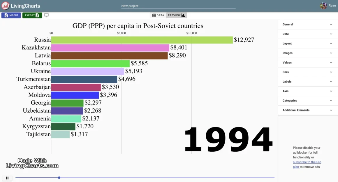
The bar race chart maker on LivingCharts is pretty easy to use. After importing your data file, changing how it looks, and making sure everything looks good in the preview, you can export it as an MP4 file or an embed code that you can put on your website.
You won’t be able to export the demo because the free plan only lets you use it as a demo, but you can look around and see if the tool’s customization meets your needs. If you choose the free plan, you can only store 5 projects. Anyone can see your projects and data.
Power BI Visuals
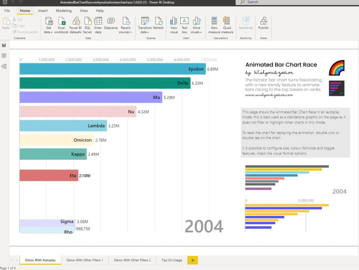
You can only use Wishyoulization’s Animated Bar Chart Race if you have a school or work email address. If you have a generic Yahoo or Gmail address, you won’t be able to use it.
It’s no cost and simple to use. If you know how to use Microsoft Power BI, a visualization tool, then this extension will be easy for you.
Matplotlib
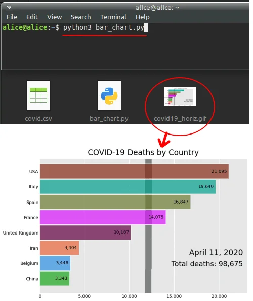
You can use Bar Chart Race with Matplotlib, which is the last free tool I could find. This is primarily a Python library, but you can use the one that comes with it to make a simple script. Like the other tools above, it asks for a dataset and then makes the bar chart race that goes with it.
The only thing that makes this different is that it can output a GIF or MP4 file. Not only is this open source, but the animation it makes is really cool. There are a few things that you can change and add to your Python projects without much trouble.
AMCharts
amCharts 5 is the newest open-source library for visualizing data. If you need more time to learn how to use new tech. When you need a drop-in data visualization solution that is easy to use but also powerful, flexible, and comes with detailed documentation and awesome customer service.
HighCharts
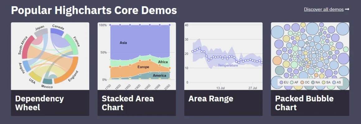
Highcharts began as Torstein’s simple search for a charting tool that would let him add snow depth readings from Vikjafjellet. On this mountain, his family has a cabin, to his homepage.
He was unhappy with the available flash plug-ins and other proprietary solutions, so he made his own solution based on open standards and shared it with everyone. He wasn’t just scratching his itch, it turns out. Highcharts has been the safe choice for cutting-edge charting tools in the very competitive data visualization market since it first came out in 2009.
Conclusion:
Each of these tools makes an animated bar chart race that looks good. You can use any of these if you want to show data that changes over time with animation. Use Flourish Studio if you want to hold the bar chart race online.
But when should you choose a bar chart? The main purpose of this chart is to show how things have changed over time. For example, the chart will show, in an animated way, how the numbers have changed over time from the start of the pandemic to the present day. Which countries have moved up to the top 10?
Share your thoughts about this list of Bar Race Chart Generators. Which one do you use to create charts?


